Examples
Basic
| Prop | Default | Type | Description |
|---|---|---|---|
ratio | 1 | number | The desired ratio. Eg: 16/9 |
Preview
Code

<template>
<div class="flex items-center justify-center">
<div class="w-full overflow-hidden sm:w-300px">
<NAspectRatio
:ratio="16 / 9"
>
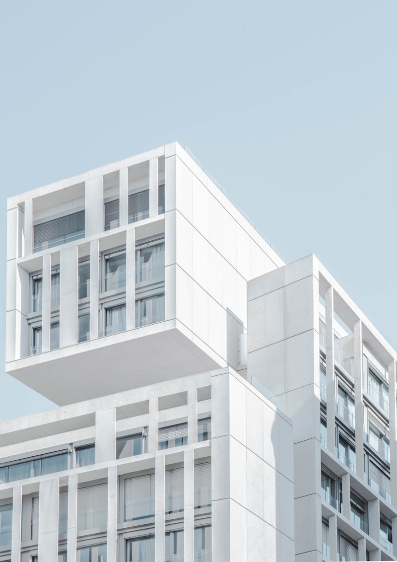
<img
src="https://i.pinimg.com/736x/bd/02/93/bd0293d5ec30a515aa241ec302812187.jpg"
alt="Abstract image"
class="object-cover"
>
</NAspectRatio>
</div>
</div>
</template>
Read more in Reka Aspect Ratio Root API.
Variants and Colors
| Prop | Default | Type | Description |
|---|---|---|---|
aspect-ratio | soft-gray | {variant}-{color} | Change the styling of the aspect-ratio component. |
| Variant | Description |
|---|---|
soft | Adds a light background color |
outline | Adds a border with the specified color |
~ | Unstyled variant (no default styling applied) |
Preview
Code
Variant Examples
Default Variant
Primary Color
Orange Color
Success Color
Primary Outline
Error Outline
Different Ratio
Custom Styling
<template>
  <div class="flex flex-col gap-4">
    <h3 class="text-lg font-semibold">
      Variant Examples
    </h3>
    <div class="grid grid-cols-2 gap-2 lg:grid-cols-4 md:grid-cols-3 sm:grid-cols-2 md:gap-6 sm:gap-4">
      <!-- Soft Gray (Default) -->
      <NAspectRatio
        :ratio="16 / 9"
      >
        <div class="h-full flex flex-col items-center justify-center p-2 sm:p-4">
          <NIcon name="i-ph-image" class="opacity-60 square-6 sm:square-8" />
          <p class="mt-1 text-xs sm:mt-2 sm:text-sm">
            Default Variant
          </p>
        </div>
      </NAspectRatio>

      <!-- Soft Primary -->
      <NAspectRatio
        :ratio="16 / 9"
        aspect-ratio="soft-primary"
      >
        <div class="h-full flex flex-col items-center justify-center p-2 sm:p-4">
          <NIcon name="i-ph-image-square" class="opacity-60 square-6 sm:square-8" />
          <p class="mt-1 text-xs sm:mt-2 sm:text-sm">
            Primary Color
          </p>
        </div>
      </NAspectRatio>

      <!-- Soft Orange -->
      <NAspectRatio
        :ratio="16 / 9"
        aspect-ratio="soft-orange"
      >
        <div class="h-full flex flex-col items-center justify-center p-2 sm:p-4">
          <NIcon name="i-ph-fire" class="opacity-60 square-6 sm:square-8" />
          <p class="mt-1 text-xs sm:mt-2 sm:text-sm">
            Orange Color
          </p>
        </div>
      </NAspectRatio>

      <!-- Soft Success -->
      <NAspectRatio
        :ratio="16 / 9"
        aspect-ratio="soft-success"
      >
        <div class="h-full flex flex-col items-center justify-center p-2 sm:p-4">
          <NIcon name="i-ph-check-circle" class="opacity-60 square-6 sm:square-8" />
          <p class="mt-1 text-xs sm:mt-2 sm:text-sm">
            Success Color
          </p>
        </div>
      </NAspectRatio>

      <!-- Outline Primary -->
      <NAspectRatio
        :ratio="16 / 9"
        aspect-ratio="outline-primary"
      >
        <div class="h-full flex flex-col items-center justify-center p-2 sm:p-4">
          <NIcon name="i-ph-selection" class="opacity-60 square-6 sm:square-8" />
          <p class="mt-1 text-xs sm:mt-2 sm:text-sm">
            Primary Outline
          </p>
        </div>
      </NAspectRatio>

      <!-- Outline Danger -->
      <NAspectRatio
        :ratio="16 / 9"
        aspect-ratio="outline-error"
      >
        <div class="h-full flex flex-col items-center justify-center p-2 sm:p-4">
          <NIcon name="i-ph-warning" class="opacity-60 square-6 sm:square-8" />
          <p class="mt-1 text-xs sm:mt-2 sm:text-sm">
            Error Outline
          </p>
        </div>
      </NAspectRatio>

      <!-- 4:3 Ratio Example -->
      <NAspectRatio
        :ratio="4 / 3"
        aspect-ratio="soft-blue"
      >
        <div class="h-full flex flex-col items-center justify-center p-2 sm:p-4">
          <NIcon name="i-ph-monitor" class="opacity-60 square-6 sm:square-8" />
          <p class="mt-1 text-xs sm:mt-2 sm:text-sm">
            Different Ratio
          </p>
        </div>
      </NAspectRatio>

      <!-- Unstyled -->
      <NAspectRatio
        :ratio="16 / 9"
        aspect-ratio="~"
        class="border border-gray-300 border-dashed dark:border-gray-700"
      >
        <div class="h-full flex flex-col items-center justify-center p-2 sm:p-4">
          <NIcon name="i-ph-code" class="opacity-60 square-6 sm:square-8" />
          <p class="mt-1 text-xs sm:mt-2 sm:text-sm">
            Custom Styling
          </p>
        </div>
      </NAspectRatio>
    </div>
  </div>
</template>
Rounded
| Prop | Default | Type | Description |
|---|---|---|---|
rounded | md | string | Set the aspect-ratio to have rounded corners. |
Preview
Code
Tower

Minimal

Structure
Widescreen
<template>
<div class="grid grid-cols-2 gap-4 rounded-lg bg-muted p-5 md:grid-cols-4">
<!-- First row -->
<NAspectRatio :ratio="3 / 4" rounded="3xl" class="group transform overflow-hidden transition-all duration-300 md:col-span-2 hover:scale-[1.03] hover:shadow-2xl">
<img src="https://images.unsplash.com/photo-1479839672679-a46483c0e7c8?q=80&w=800" alt="Dark skyscraper silhouette" class="h-full w-full object-cover transition-transform duration-500 group-hover:scale-110">
<div class="absolute inset-0 flex items-center justify-center from-black/80 to-black/20 bg-gradient-to-t opacity-0 backdrop-blur-sm transition-all duration-300 group-hover:opacity-100">
<span class="transform border border-white/20 rounded-full bg-white/10 px-5 py-2 text-white font-medium shadow-lg backdrop-blur-md transition-transform duration-300 -translate-y-2 group-hover:translate-y-0">Tower</span>
</div>
</NAspectRatio>
<NAspectRatio :ratio="1 / 1" rounded="2xl" class="group transform overflow-hidden border border-gray-100 shadow transition-all duration-300 dark:border-gray-800 hover:shadow-2xl">
<img src="https://images.unsplash.com/photo-1494145904049-0dca59b4bbad?q=80&w=800" alt="Abstract architecture patterns" class="h-full w-full object-cover transition-transform duration-500 group-hover:scale-110">
<div class="absolute inset-0 flex items-center justify-center from-black/80 to-black/20 bg-gradient-to-t opacity-0 backdrop-blur-sm transition-all duration-300 group-hover:opacity-100">
<span class="transform border border-white/20 rounded-full bg-white/10 px-5 py-2 text-white font-medium shadow-lg backdrop-blur-md transition-transform duration-300 -translate-y-2 group-hover:translate-y-0">Minimal</span>
</div>
</NAspectRatio>
<NAspectRatio :ratio="3 / 4" rounded="full" class="group transform overflow-hidden shadow-md transition-all duration-300 hover:shadow-2xl">
<img src="https://images.unsplash.com/photo-1611416517780-eff3a13b0359?q=80&w=800" alt="Geometric building architecture" class="h-full w-full object-cover transition-transform duration-500 group-hover:scale-110">
<div class="absolute inset-0 flex items-center justify-center from-black/80 to-black/20 bg-gradient-to-t opacity-0 backdrop-blur-sm transition-all duration-300 group-hover:opacity-100">
<span class="transform border border-white/20 rounded-full bg-white/10 px-5 py-2 text-white font-medium shadow-lg backdrop-blur-md transition-transform duration-300 -translate-y-2 group-hover:translate-y-0">Structure</span>
</div>
</NAspectRatio>
<!-- Second row -->
<NAspectRatio :ratio="16 / 9" rounded="lg" class="group col-span-2 transform overflow-hidden shadow-md transition-all duration-300 md:col-span-4 hover:scale-[1.02] hover:shadow-2xl">
<img src="https://images.unsplash.com/photo-1512917774080-9991f1c4c750?q=80&w=800" alt="Modern architectural building" class="h-full w-full object-cover transition-transform duration-500 group-hover:scale-110">
<div class="absolute inset-0 flex items-center justify-center from-black/80 to-black/20 bg-gradient-to-t opacity-0 backdrop-blur-sm transition-all duration-300 group-hover:opacity-100">
<span class="transform border border-white/20 rounded-full bg-white/10 px-5 py-2 text-white font-medium shadow-lg backdrop-blur-md transition-transform duration-300 -translate-y-2 group-hover:translate-y-0">Widescreen</span>
</div>
</NAspectRatio>
</div>
</template>
Slots
| Name | Props | Description |
|---|---|---|
default | aspect | The default slot. |
Preview
Code
 40%
40%Title
Description of the card.<template>
<div class="grid w-full place-items-center">
<NCard
class="w-full sm:w-300px"
:_card-header="{
class: 'p-0',
}"
:_card-content="{
class: 'mt-4 pb-4',
}"
>
<template #header>
<NAspectRatio
:ratio="5 / 2" class="relative"
rounded="md b-none"
>
<template #default="{ aspect }">
<img
src="https://images.unsplash.com/photo-1470071459604-3b5ec3a7fe05?ixlib=rb-4.0.3&ixid=M3wxMjA3fDB8MHxwaG90by1wYWdlfHx8fGVufDB8fHx8fA%3D%3D&auto=format&fit=crop&w=3840&q=80"
alt="Nature landscape image"
class="h-full w-full object-cover"
>
<span class="absolute bottom-2 right-2 text-base fw500">{{ aspect }}%</span>
</template>
</NAspectRatio>
</template>
<p class="fw600 leading-none">
Title
</p>
<span class="text-sm opacity-50">Description of the card.</span>
</NCard>
</div>
</template>
Presets
shortcuts/aspect-ratio.ts
type AspectRatioPrefix = 'aspect-ratio'

export const staticAspectRatio: Record<`${AspectRatioPrefix}-${string}` | AspectRatioPrefix, string> = {
  // base
  'aspect-ratio': 'overflow-hidden',

  // static variants
  'aspect-ratio-soft-gray': 'bg-muted border border-base',
  'aspect-ratio-outline-gray': 'bg-base border border-base',
}

export const dynamicAspectRatio: [RegExp, (params: RegExpExecArray) => string][] = [
  [/^aspect-ratio-soft(-(\S+))?$/, ([, , c = 'gray']) => `bg-${c}-50 dark:bg-${c}-900 border-${c}-200 dark:border-${c}-700/58`],
  [/^aspect-ratio-outline(-(\S+))?$/, ([, , c = 'gray']) => `border border-${c}-200 dark:border-${c}-700/58`],
]

export const aspectRatio = [
  ...dynamicAspectRatio,
  staticAspectRatio,
]
Props
types/aspect-ratio.ts
import type { AspectRatioProps } from 'reka-ui'
import type { HTMLAttributes } from 'vue'

interface BaseExtensions {
  class?: HTMLAttributes['class']
  rounded?: HTMLAttributes['class']
}

export interface NAspectRatioProps extends AspectRatioProps, BaseExtensions {
  /**
   * Allows you to add `UnaUI` aspect-ratio preset properties,
   * Think of it as a shortcut for adding options or variants to the preset if available.
   *
   * @see https://github.com/una-ui/una-ui/blob/main/packages/preset/src/_shortcuts/aspect-ratio.ts
   * @example
   * aspect-ratio="soft-primary"
   */
  aspectRatio?: string
  /**
   * `UnaUI` preset configuration
   *
   * @see https://github.com/una-ui/una-ui/blob/main/packages/preset/src/_shortcuts/aspect-ratio.ts
   */
  una?: {
    aspectRatio?: HTMLAttributes['class']
  }
}
Components
AspectRatio.vue
<script setup lang="ts">
import type { NAspectRatioProps } from '../../types/aspect-ratio'
import { reactiveOmit } from '@vueuse/core'
import { AspectRatio } from 'reka-ui'
import { cn } from '../../utils'

const props = withDefaults(defineProps<NAspectRatioProps>(), {
  aspectRatio: 'soft',
  rounded: 'md',
})

const delegatedProps = reactiveOmit(props, 'class')
</script>

<template>
  <AspectRatio
    v-slot="{ aspect }"
    v-bind="delegatedProps"
    :class="cn(
      'aspect-ratio',
      props.una?.aspectRatio,
      props.class,
    )"
    :aspect-ratio
    :rounded
  >
    <slot :aspect />
  </AspectRatio>
</template>